Manage loading 🌀state while your content loads 📝 in React
— react, javascript — 2 min read
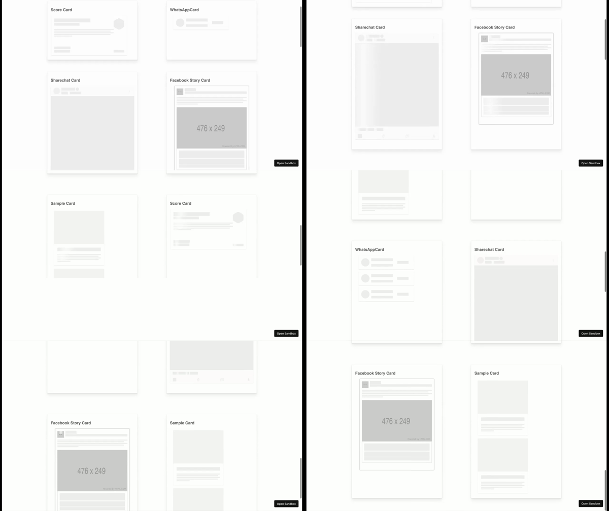
Often we need to show a placeholder skeleton, before our actual content loads. We can also term this as loading state before our actual contents loads on the page. Today I want to show you how we can create simple “placeholders” to show while the content loads. This is done by almost all the web applications in order to improve the experience of our users.

Here's a solution to create skeleton for your loading state. React Place Moulder uses existing component structure to render loading skeletons with very minimal code changes. React place moulder is more of a philosophy rather than actual package. This is an amazing npm package developed by my friend Vihang Patel.
Installation
How it works
- Class name
stensilis required to be added to render the dom element that is being loaded. - Create a dummy data or Schema exactly how your app would pass to the component
- To render loading state of the list, use StencilList HOC, or to show loading state of individual component, use
StencilHOC. See props table for accepted props.
~ Lets get started with each of the components ~
StencilList
| prop | type | |
|---|---|---|
| data* | object | data is dummy or representational data which will be used to determine the dummy space occupied by the DOM element |
| length | number | Number of repetitive skeletons required to fill in the placeholder list |
| schema* | object | If data is not provided, provide schema of the props required by Component. |
| Component | ReactComponent | Component for which we want to generate skeleton on the fly |
Stencil
| prop | type | |
|---|---|---|
| Children | ReactComponent | Component on which loading state is required |
Available selectors to achieve desired result. Add required class name along with other classes where you want to show loading state.
Override or extend styles
- To override or extend visuals, extend below classes or create some custom class and use it in your application:
| Selector Class | Description |
|---|---|
| stensil | To get loading state |
| stensil-ignore | To ignore the component in the loading state. Won't show stencil over there |
| stensil-dark | Dark background, useful in image loaders |
| stensil-svg | To get the exact shape of the SVG as a stencil loader |
| stensil-para | To show the paragraph, can be used where there is short description used |
Creating custom classes 👇
- Note You can have your own classes to override visuals in loading behaviour.
- For that wrap your css under the `.enable-stensil` selector and just use it in your application.
createObjectFromSchema - method
- Takes object schema as an argument and returns dummy component props JSON. It supports nested object structure as well.
Example
- Import
StencilList,Stencil,createObjectFromSchemaas per your usecase
- To render loading state of the sample card, add
stensil-darkclass name to the appropriate dom element.
- Invoke HOC when the data is being loaded. Pass
wDataas a prop to theStencilListcomponent. RememberwDatais similar in struture to the actual data.`.
- Provide
dataorschema. Remember heredatatakes precedence over schema.
- Where integer value against each prop indicate average length to show the stencil. This is customizable.
For example wData looks something like this 👇
Alternatively you can use schema and pass it as a prop 👇
As you can see, creating a friendly interface while waiting for our content is not very difficult and surely helps to improve the impression that users have when visiting our page because they do not see blank pieces waiting to be filled and instead have an excellent user experience.
Checkout the repo for more details
Also checkout some real life that you could use in your projects examples
Thankyou for reading ❤️